
QuickBooks Tax Checklist
How might we instill confidence in our customers when they’re preparing their taxes?
We reimagined how QuickBooks’s tax checklist can provide guidance during the one of most stressful time of the year for small businesses and self-employed folks.
PRODUCT
QuickBooks Self-Employed,
2019—2020
MY ROLE
Responsible for user research, ideation, visual explorations, and interaction design.
Problem
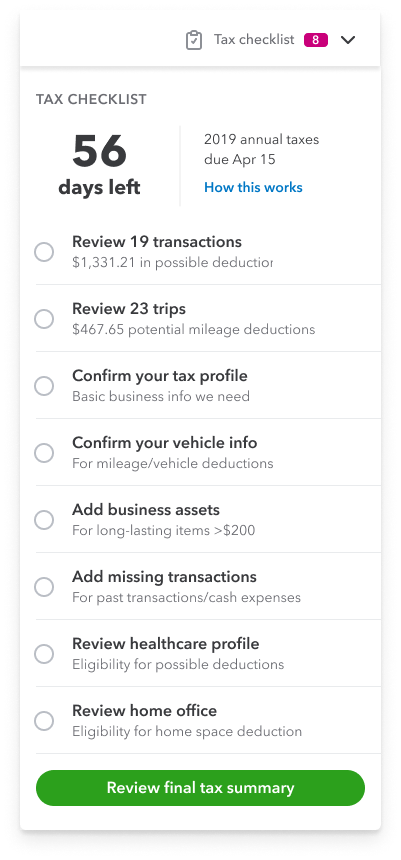
The previous tax checklist was built to help customers quickly organize and review their final tax summary before exporting it to an accountant or tax software. Unfortunately, data shows that only a small fraction of customers end up completing the checklist and exporting their tax summary.
Previous tax checklist
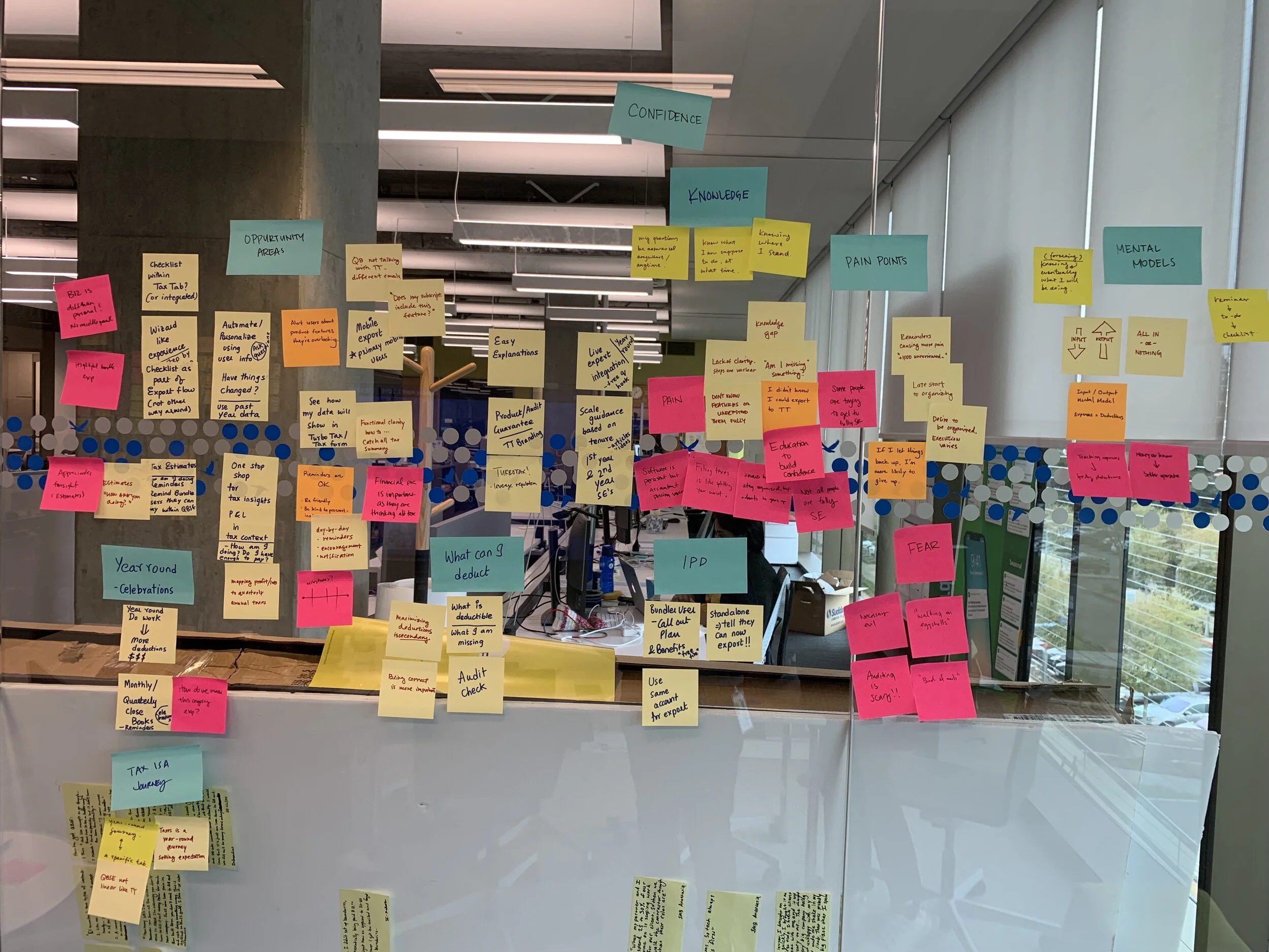
Research
We wanted to understand why users are not exporting their tax summary from the tax checklist. Through usage data, customer interviews, and product reviews, it became clear that there were incorrect assumptions made about user behavior around preparing for taxes.
01 Users rarely stay organized throughout the year
Users know staying organized will save them time during tax season, but running their business still takes top priority. Returning to the product and seeing a loaded checklist can be overwhelming.
“Once I saw that I had over a thousand of uncategorized transactions, I just gave up. I’ll try to be on top next year.”
02 Users don’t know their way around the entire product
Users engage regularly with just a set amount of features that fits their personal work flows. The checklist draws data from numerous places in the product (transactions, trips, home office deductions, etc) and we expected the user to navigate and make sense of it all.
“How does all this even all work? Do they talk to each other? I think they should…”
03 No one really is confident about their taxes
We were surprised by how much tax knowledge our users had during customer interviews. However even the most tax savvy users were not confident with their taxes. Our static checklist just wasn’t providing the level of assurance users are looking for.
“I’m not confident at all. I don’t want to be audited again, but double and triple checking can be so time consuming.”
Hypothesis
The research made it evident that the checklist just wasn’t helping the majority of users. It punished users for not keeping up with their taxes and didn’t offer the level of assurance they wanted. Our hypothesis was that if the checklist was broken down to more simpler steps, then users would be more likely to start and complete it.
Product teardown
The checklist’s tasks were necessary for the user to complete their tax summary accurately. How might we present the checklist in a way that’s more palpable? We started by deconstructing the checklist and finding how exactly each task benefit the user and fit in their tax preparation journey.
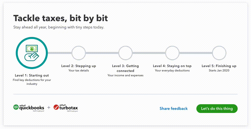
Conceptual explorations
Different visual metaphors were explored to represent a user’s tax journey. The team was initially wary about adding more clicks to this already long flow. However, the visual of a progress bar with prominent nodes balanced expectations and tested well with users.
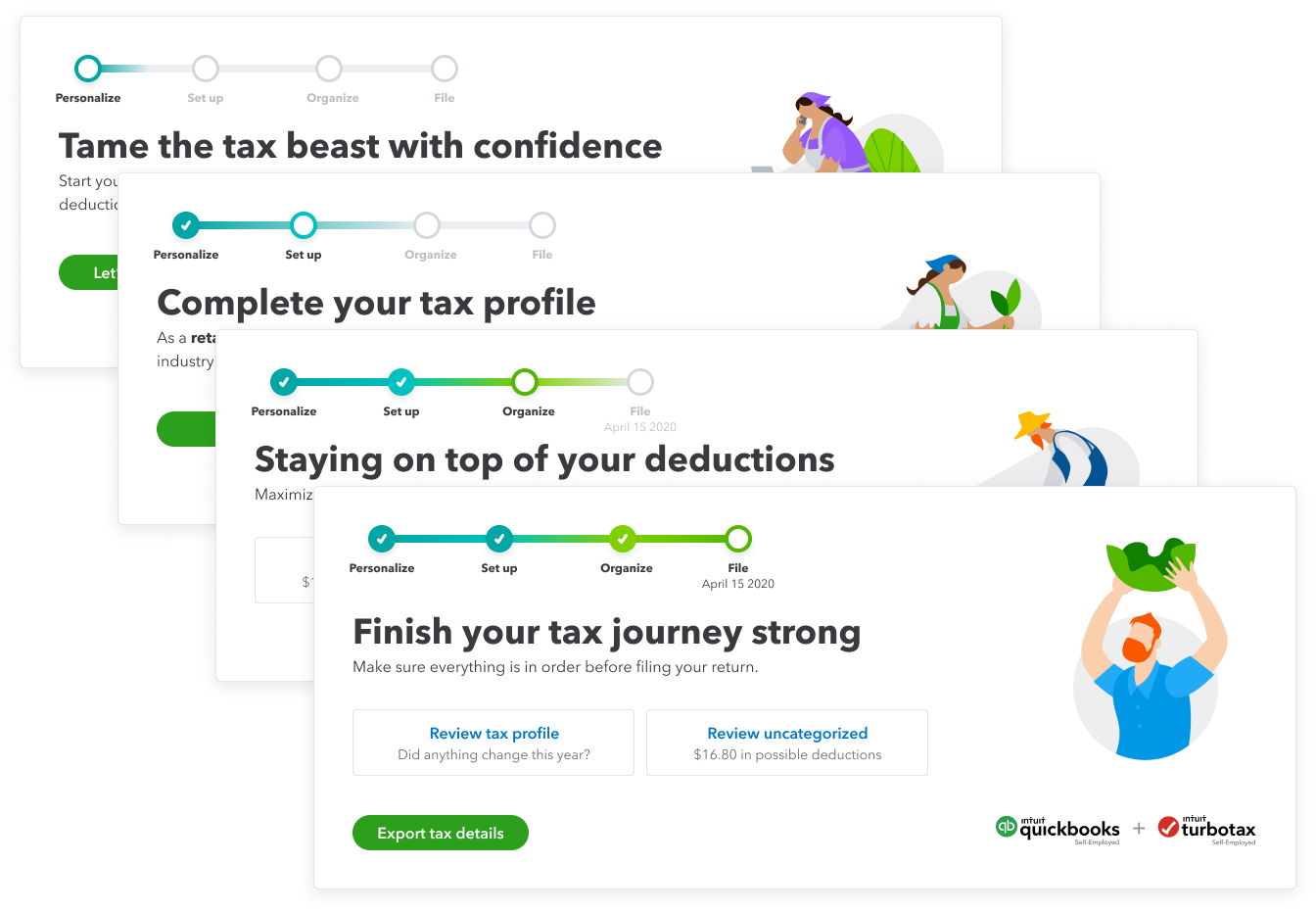
“Grow with your taxes” concept
Initial animation test
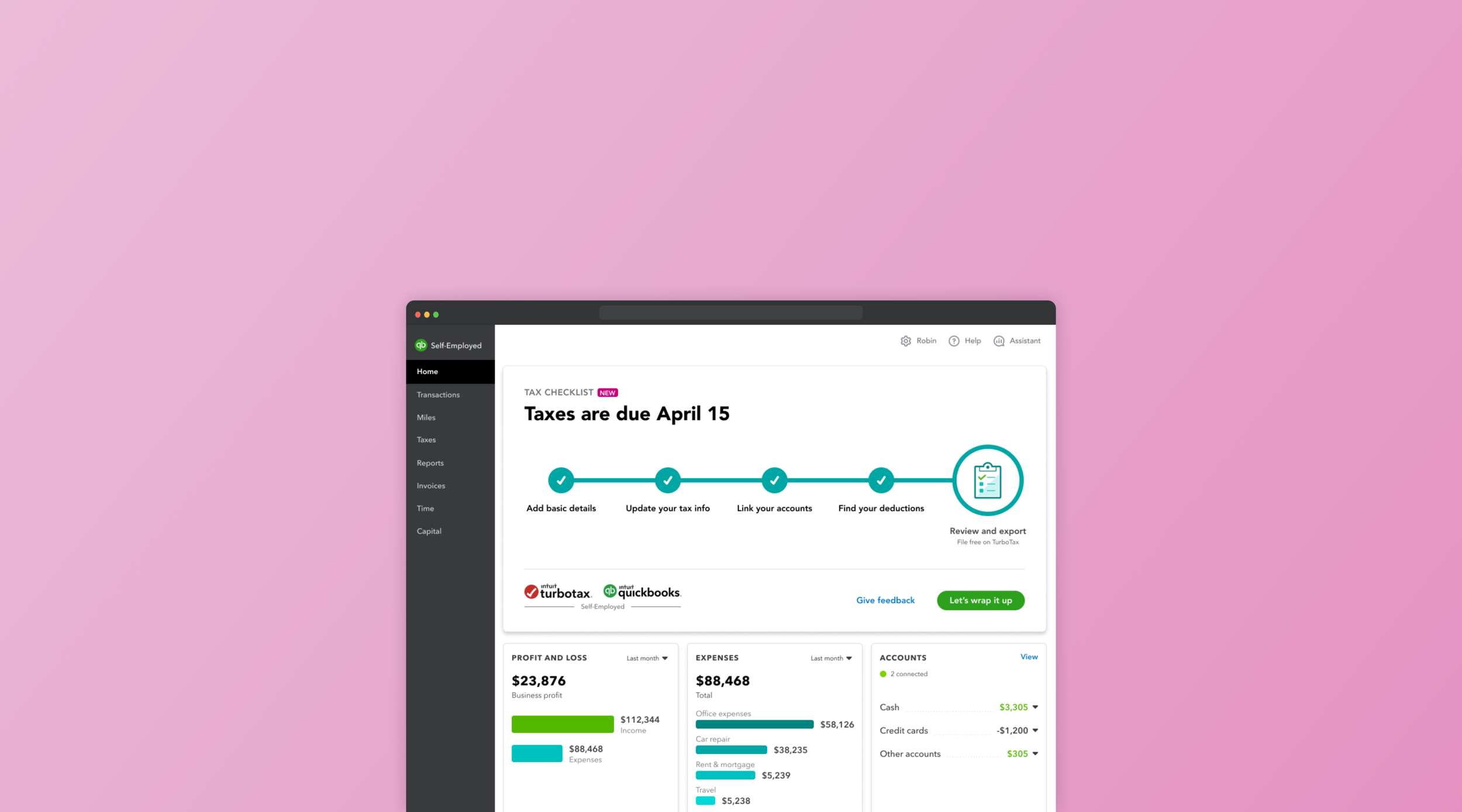
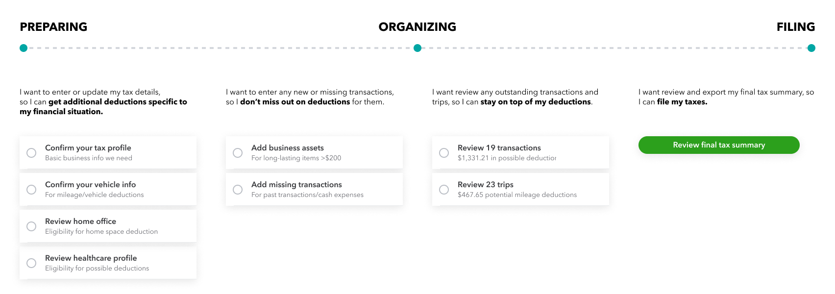
Delivery
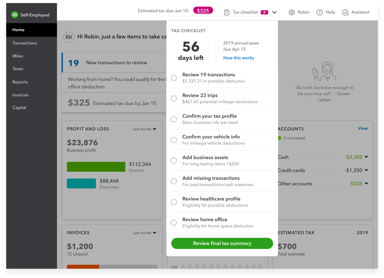
Before - Previous tax checklist can be overwhelming and lacked task prioritization.
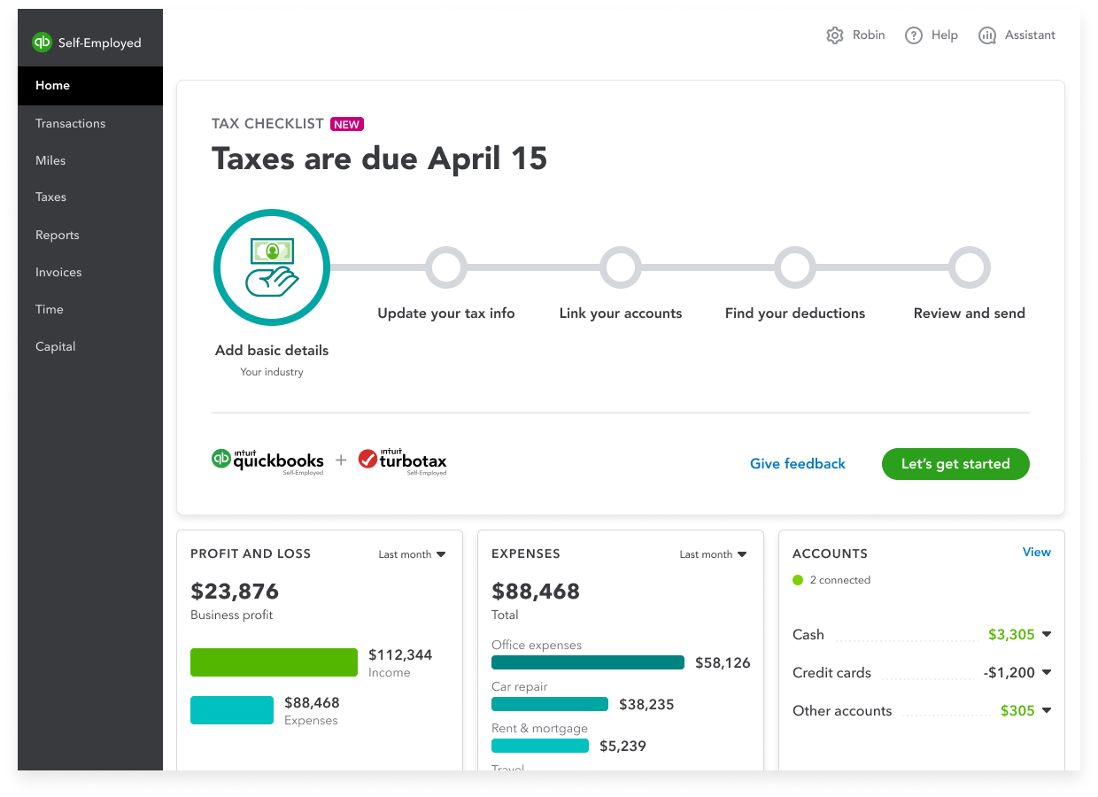
After - A guided step flow that goes over all tasks in bite-sized levels and shows progress along the way.
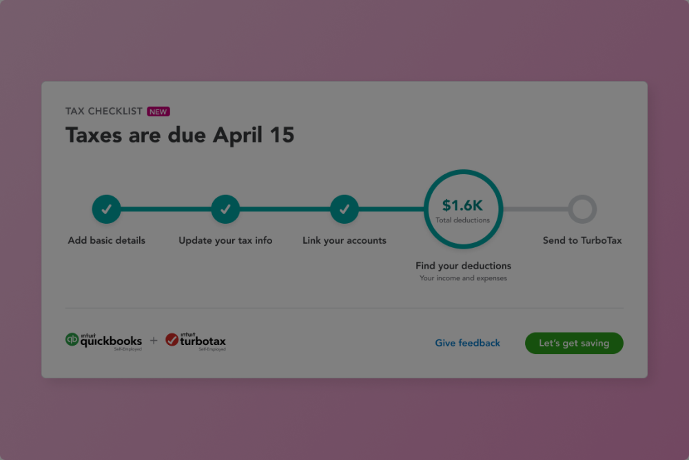
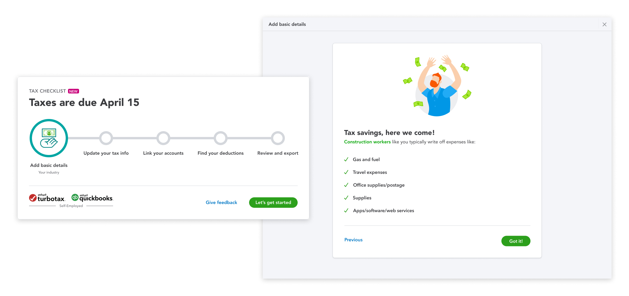
Add basic details
Users are asked about their product usage and industry. This will tailor the tax experience by surfacing industry-specific deductions.
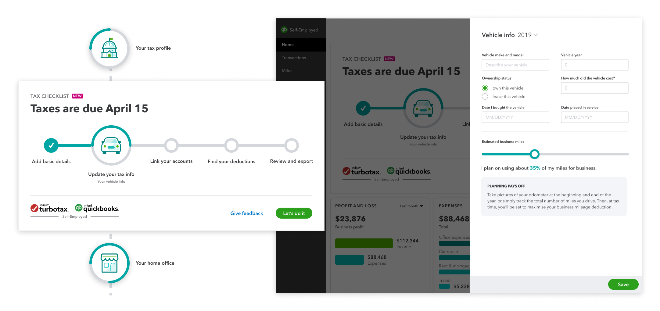
Update tax info
Users are asked to complete their tax profile, vehicle info, home office, and healthcare info. A more accurate tax summary can be provided by understanding their full financial picture.
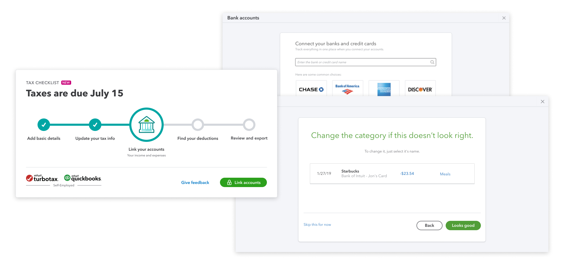
Link accounts
Users connect their bank and credit card accounts to uncover their potential deductions. Their industry info provided earlier allow for suggested bulk auto-categorization to save time.
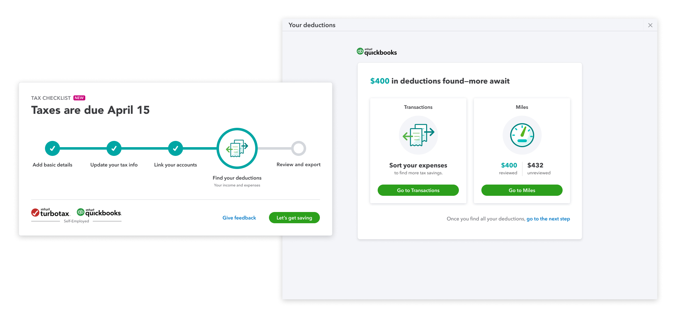
Find deductions
Any additional uncategorized transactions or miles is called out with the potential deduction amount.
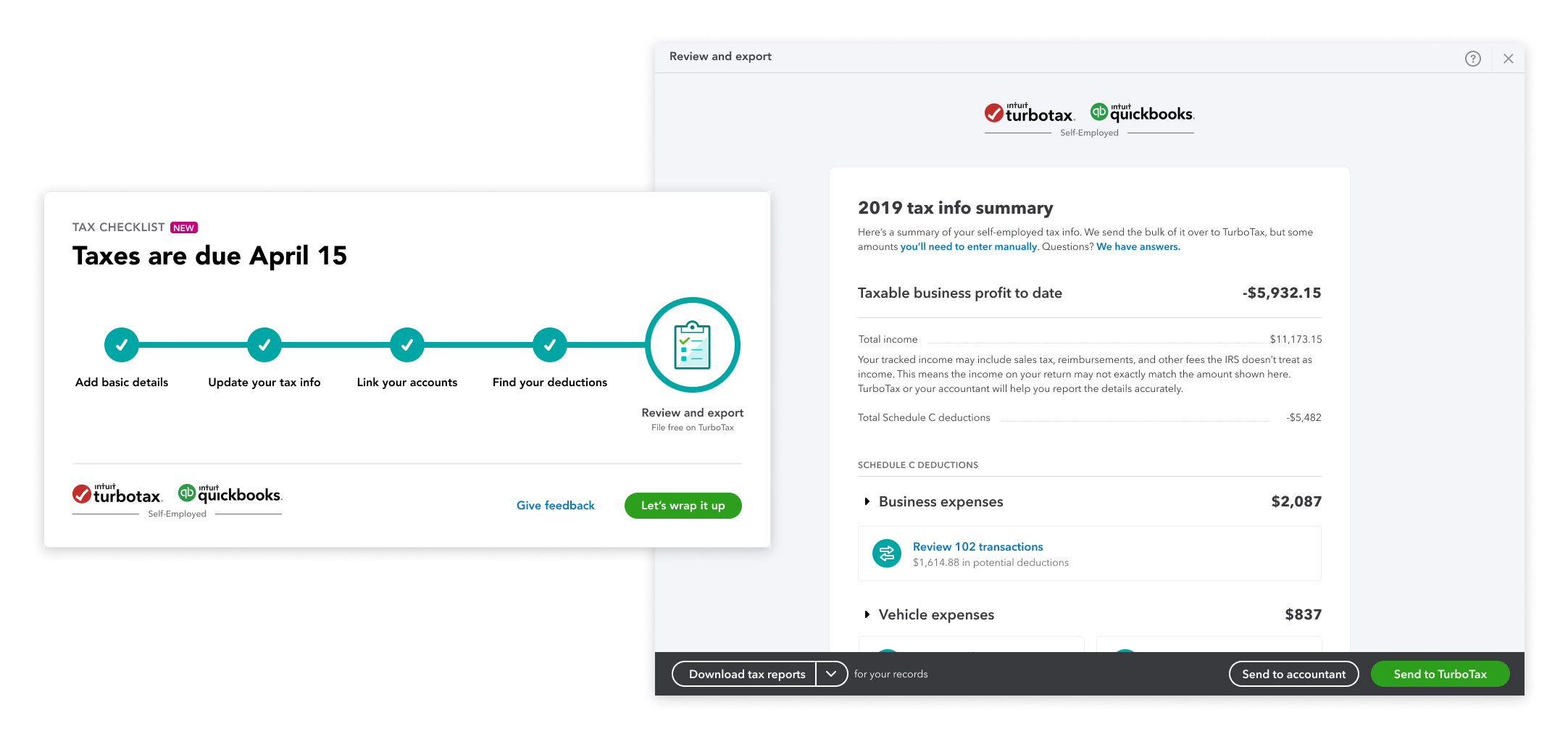
Review and export
Users can double check their tax details on their tax summary before downloading for their accountant or exporting directly to TurboTax.
Learnings
This was a really exciting project for me to work on as it provided real customer value, involved a ton of research, and detailed interaction work with lots of use cases. Despite the launch being ultimately delayed due to the increased scope and a shift in priorities, it was still a rewarding project.
Communicating early and often - Our partners were initially expecting a much smaller, tidier project. As the project scope grew, the technical constraints also grew. I learned the importance of bringing everyone into the conversation early on.
Learning to say ‘No’ -Many different use cases appeared when we were internally testing the experience. But it was just not realistic to solve for all of them during initial launch. I learned to determine where the real value was for the user and the business.
Fighting for good UX - We needed to have conviction with what we were designing. I learned to leverage our perspective to show stakeholders and leadership that this project was worth resourcing.
Outcomes
We A/B tested this experience against the control and it reached statistical significance. It went beyond our initial hypothesis in the following:
Increase in checklist starts
Increase in checklist completes
Increase in TurboTax export conversion during tax season