Redesigning QuickBooks Taxes
How might we design a tax experience for those who don’t like taxes?
QuickBooks Self-Employed annual and quarterly taxes pages help users stay on top of their taxes and maximize their deductions. This project started off as a just visual refresh, but evolved to an opportunity to rethink the core experience. I lead the redesign to make taxes more action oriented and insightful.
PRODUCT
QuickBooks Self-Employed,
2019—2020
MY ROLE
Lead designer through end to end process: user research, ideation, visual explorations, interaction design, testing, support through launch
Problem with annual taxes
Annual taxes informed users of their taxable profits and Schedule C deductions so that there won’t be any surprises come tax time. However its engagement remained relatively low despite being one of the product’s core feature offerings.
Research
Our team looked through usage data, conducted customer interviews and dug through existing customer research around taxes. These are the insights that held true across all channels:
01 Users would rather spend their time running their business than organizing for taxes.
Their business is their top priority. The design for the old tax pages didn’t match up with this existing user mental model. The old pages functioned more like a one-size-fit-none report that required the users to carefully read through.
“It’s not that I don’t want to do it [organizing for taxes], it’s just that I’m not always thinking about it. I need to make sure my business stays running before everything else.”
02 Users are looking elsewhere for the same information
Users would look at multiple places in the product (transactions, mileage) and outside (paychecks, credit card statements) for their source of truth.
“It’s like a giant scavenger hunt during tax time. I gotta start organizing earlier this year.”
Design principle
Understanding the mental model of the user helped me develop a clear vision of their expectations. We developed a set of experience principles that were used to gut‐check design decisions, articulate core values and drive visual attributes the tax experience should uphold.

Delivery
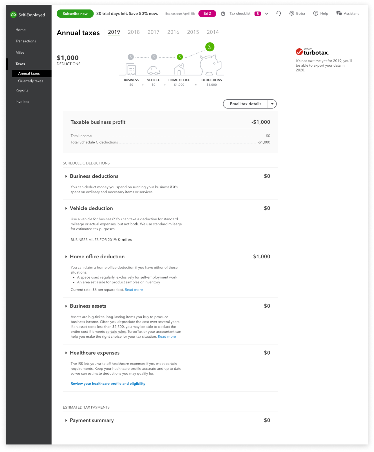
Before - A one-size-fit-none visual that doesn’t show metrics in context. A static summary that required customer to carefully read through to find what they need.
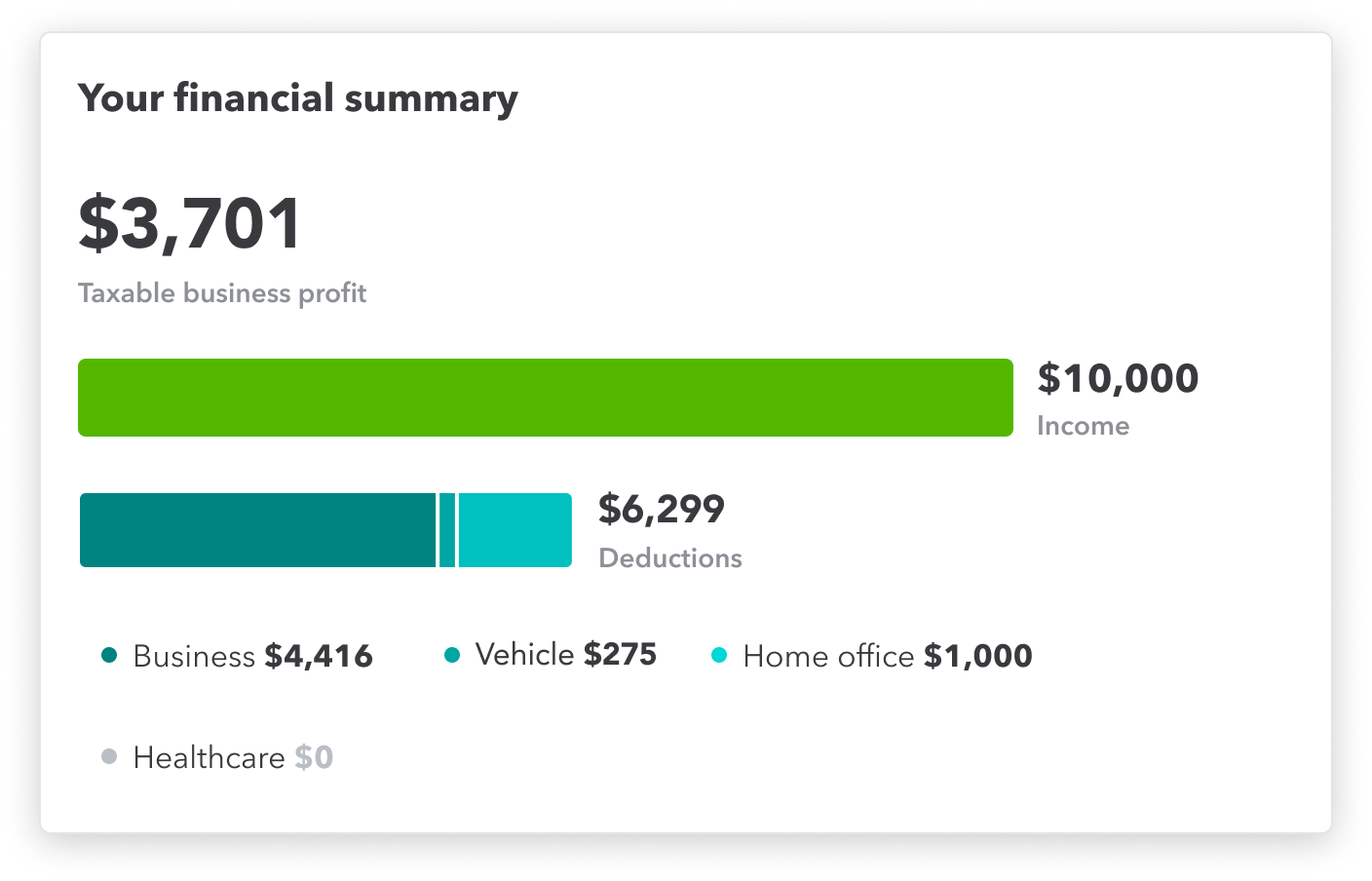
After - The user can see a high level of their tax financial summary at a glance. A living summary that empowers the customer to take action with their deductions.
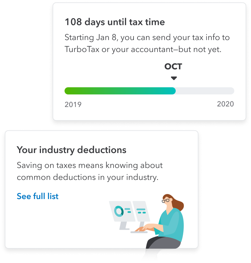
At a glance
Numerous user testing sessions helped the team identified what tax metrics matter most to the user. They can see a snapshot of their annual taxes before diving in any deeper.
In product discovery
In product discovery are better incorporated into the page with the redesign. A framework was created to allow other teams to also leverage this space to surface relevant content to the user.
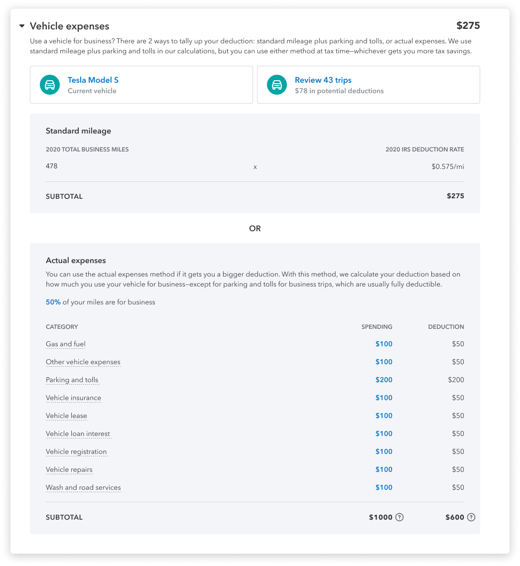
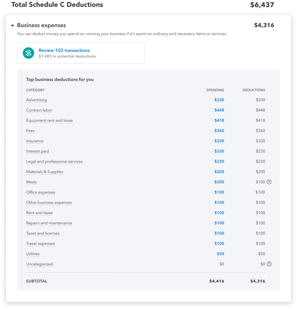
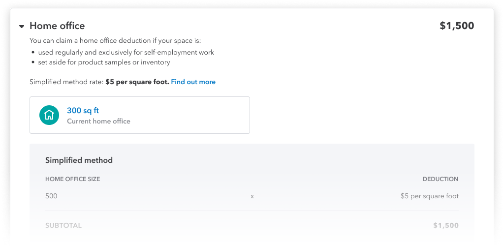
Total Schedule C Deductions
Each Schedule C section is expandable with actionable task cards. Performing action on these task cards will result in the changes to the deduction amount.
Problem with quarterly taxes
Our customer care partners informed us of a significant spike of calls during quarterly estimate deadlines regarding payments. QuickBooks Self-Employed allows users to conveniently pay their quarterly estimated taxes in product. However, they are left hanging after their payment is sent.
Research
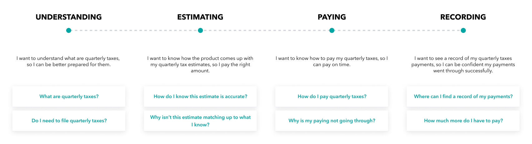
Partnering with our team of customer care partners, we had access to VOC and identified customers available for research sessions. Fortunately (or unfortunately) for us, there was no shortage feedback for the current experience. After multiple rounds of research, we learned there were opportunities to improve upon the experience even before estimated taxes were paid. We mapped out the customer journey and identified common goals/questions throughout each main segments.
Delivery
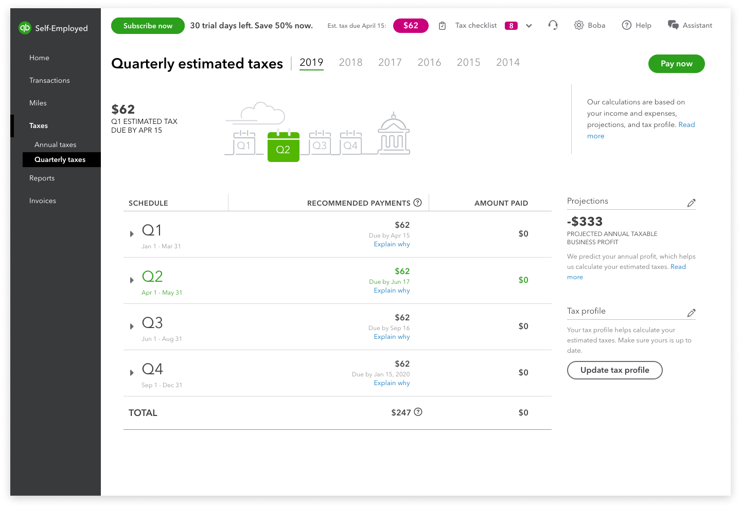
Before - Payment progress is not easily understood. Record of estimated payments is divided and hidden between 4 expandable accordions.
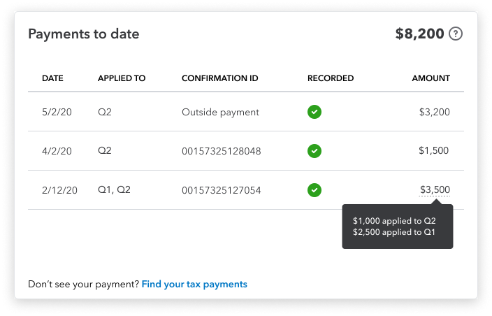
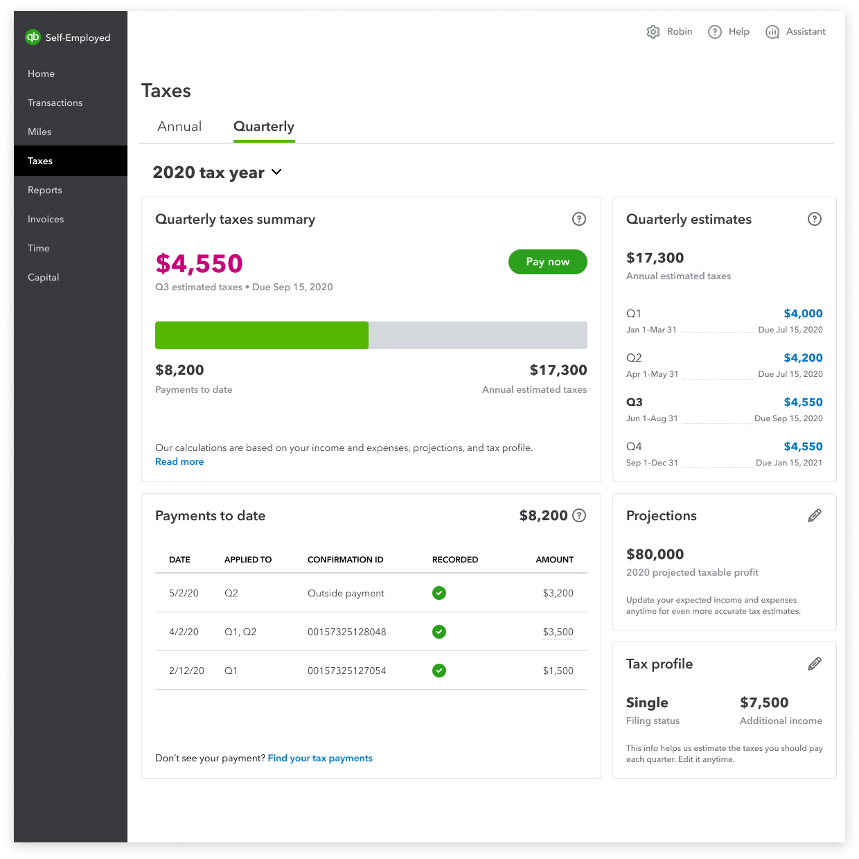
After - Payments to date and overall progress are visible. Payment table displays all the essential details of the transaction.
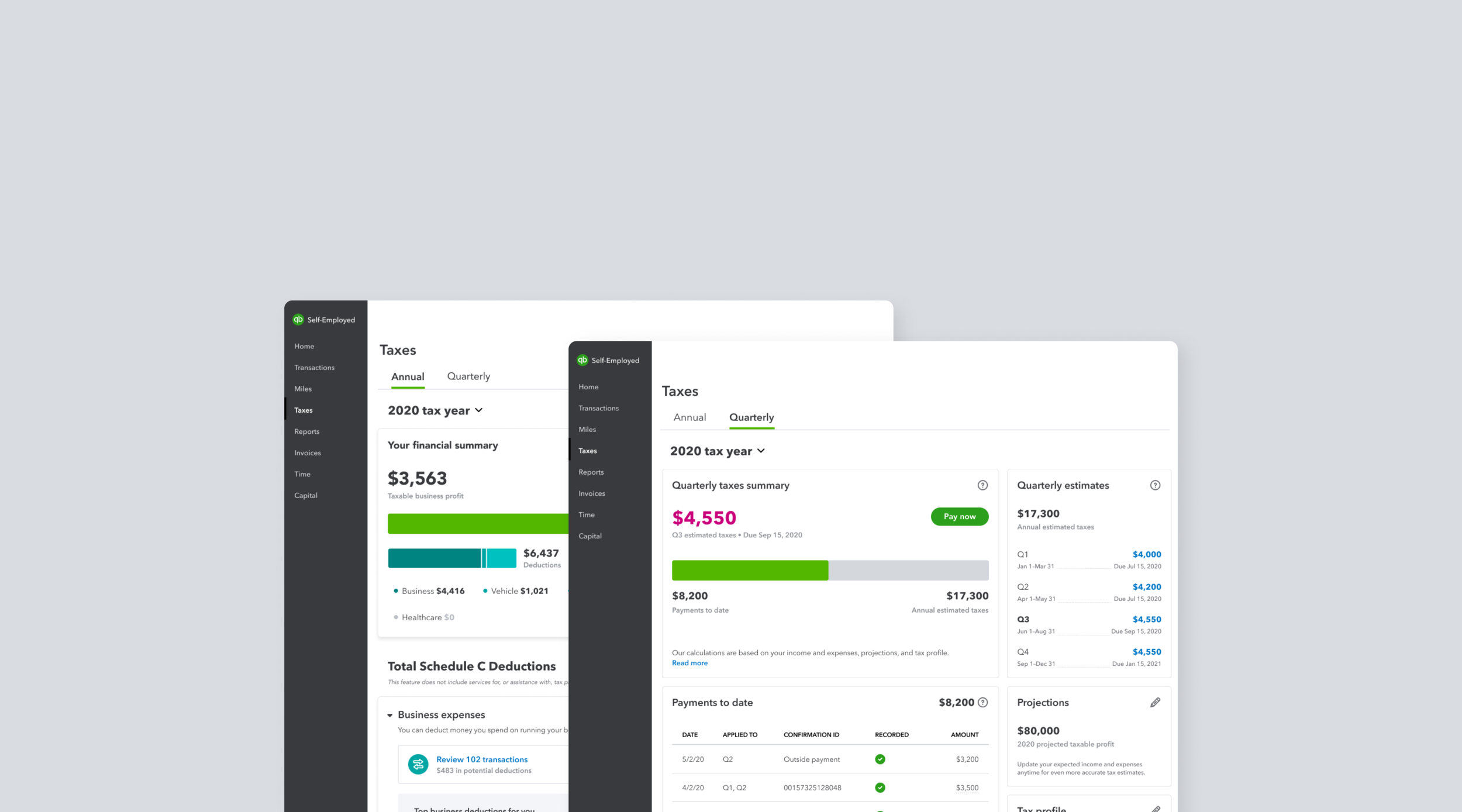
Payment process
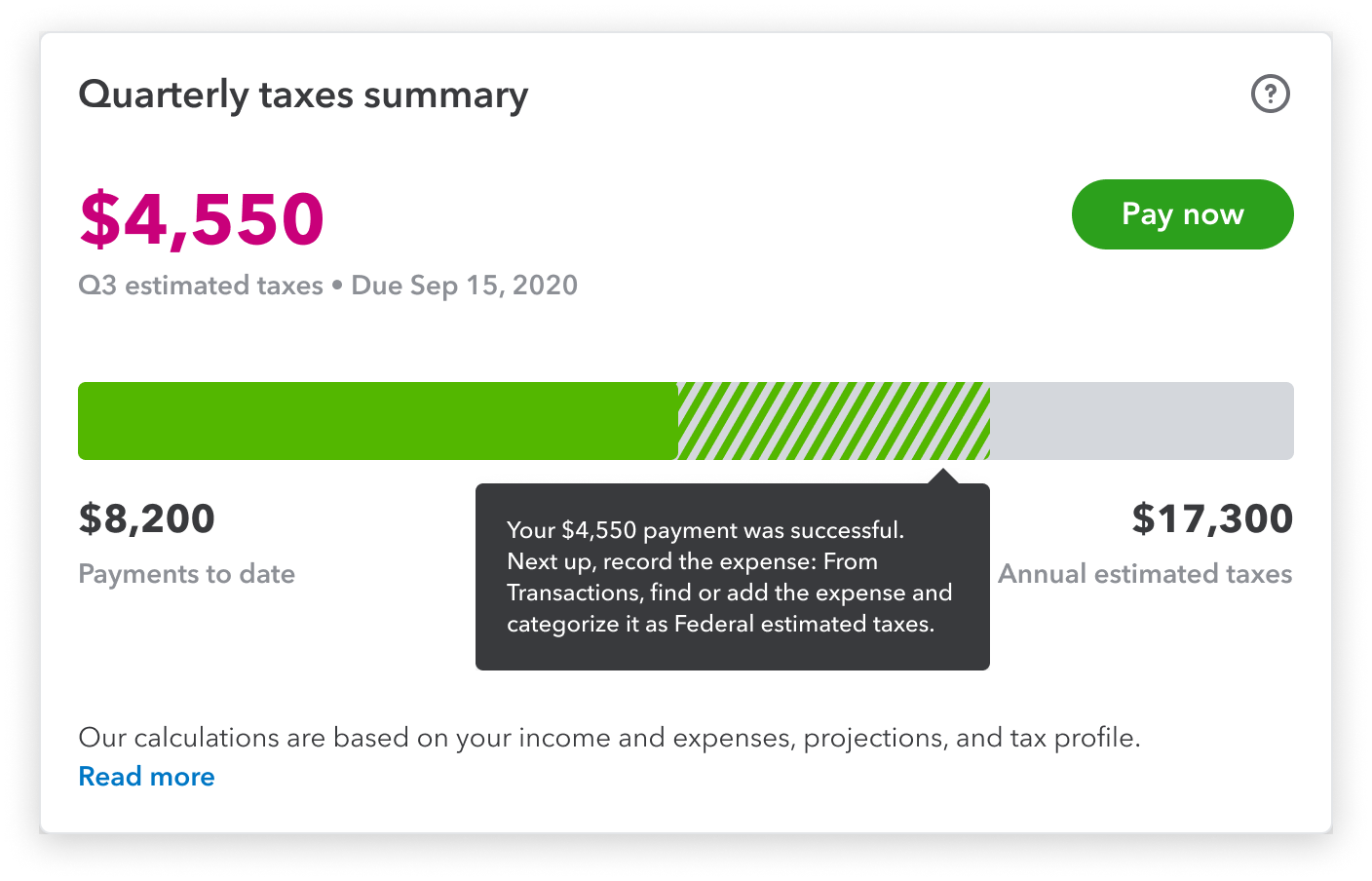
Users needed a better way to visualize the progress that they’re making towards paying their estimated taxes. The progress bar also accounts for the limbo state of when a payment is successful but not recorded in product yet.
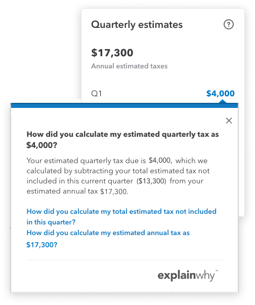
Estimate explaination
Users wanted to know how we came up with their quarterly tax estimates. The estimate breakdown tooltip was surfaced up a level to increase discoverability. We collaborated with content and care partners to further expand the tooltip’s content to include similarly asked questions.
Payments table
Sometimes the most simple solution is the best. This payment table displays all the payment details that the users wanted to see. It also provides clarity to payments that span across multiple quarters. An option to find their tax payments is also included.